Founded on innovation and practical problem solving, THEAM Conveyors traces its roots back to 1978 in France, when René Thenaud and Amour of Mixer Services developed the first mixer-mounted conveyor. By combining their names, THEAM was born. What started as a simple and rugged solution quickly gained attention across Europe and later the United States, where the equipment was redesigned and refined to meet the demands of American ready-mix operations. Through decades of engineering advancements, field testing, and a commitment to service, THEAM established itself as a trusted leader in mixer-mounted conveyor systems.
Today, operating as THEAM USA under Westcon Manufacturing Inc., the company manufactures and supports conveyor models tailored to ready-mix producers across North America. With more than four decades of continuous improvement, innovation such as wireless radio controls and enhanced field-tested components, and a long-standing focus on quality, performance, and reliability, THEAM continues to serve concrete producers with equipment designed to improve efficiency, jobsite flexibility, and truck turnaround.
When THEAM reached out, they were not just looking for a new logo or a redesigned website. They were looking for a partner who could handle both branding and development under one roof and truly understand the weight of their legacy. The challenge was clear: modernize the brand without losing the heritage that dates back to 1978. They did not want a logo that was simply attractive. They wanted one rooted in meaning, one that reflected innovation, durability, and the story behind the name itself.
On the website side, the situation was equally critical. After working with multiple agencies and starting projects that were never fully completed because the results did not feel right, they were understandably cautious. They needed a team that could translate their engineering strength, product reliability, and decades of industry leadership into a digital experience they would be proud of. More than a redesign, they wanted a website they would genuinely love and feel confident standing behind for years to come.
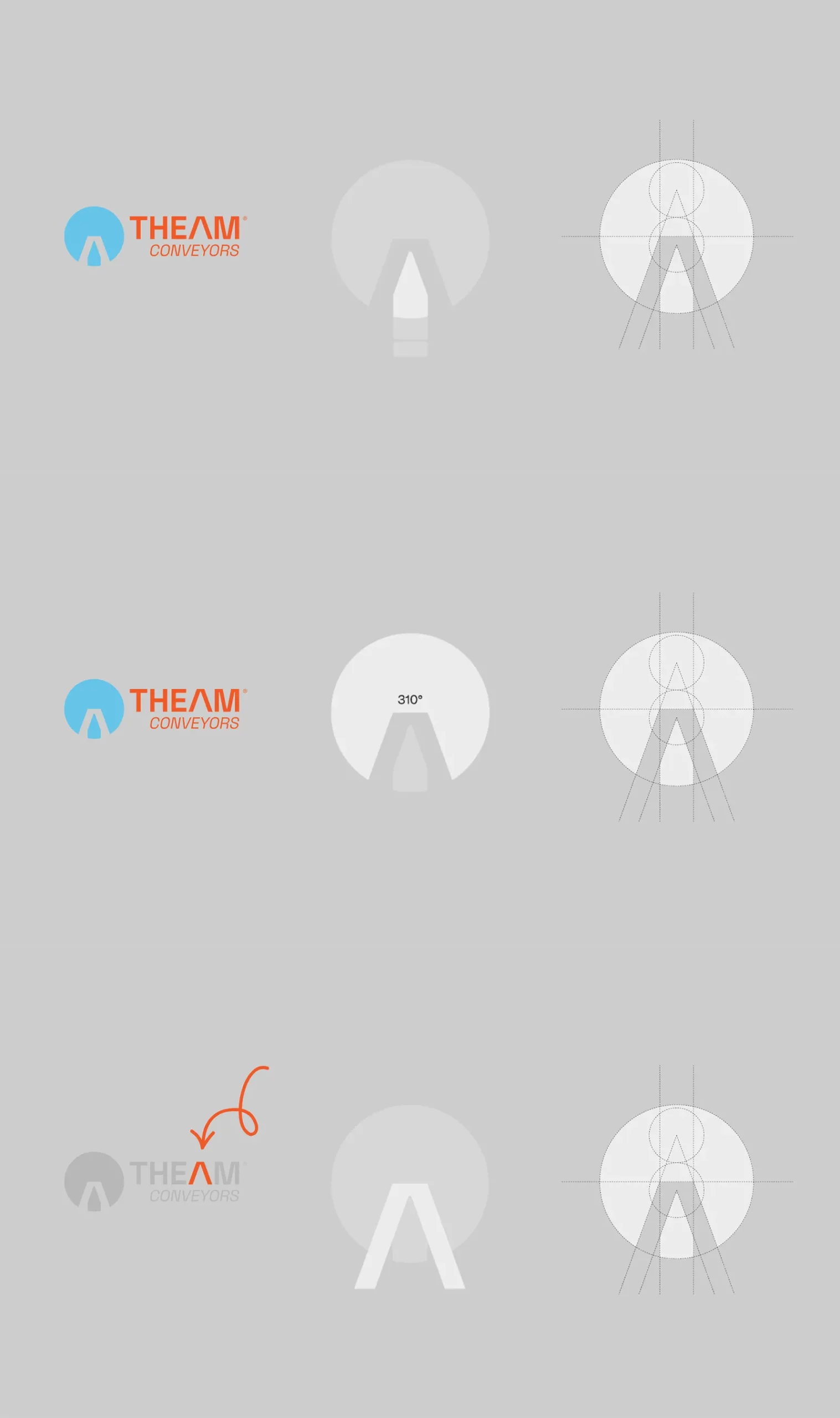
Our solution began with strategy, not sketches. For the logo, we created a mark that carries multiple layers of meaning. The icon represents the top view of a mixer truck, subtly forming the letter “A” in THEAM, while also symbolizing the 310 degree rotation capability of the conveyor system. It is not just a visual element. It reflects product functionality, engineering precision, and the company’s core innovation. The result is a modern identity that respects their legacy while clearly signaling forward movement.
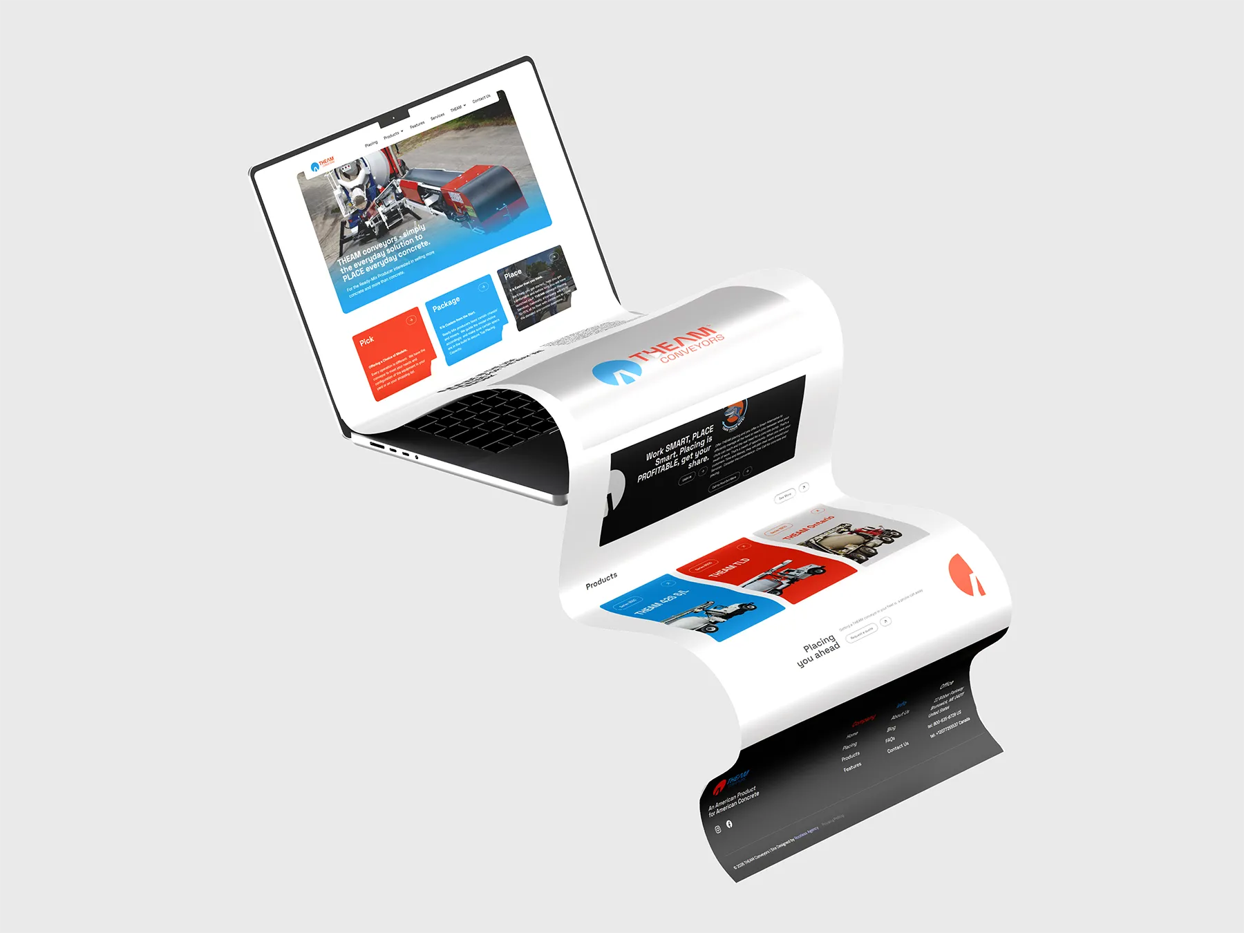
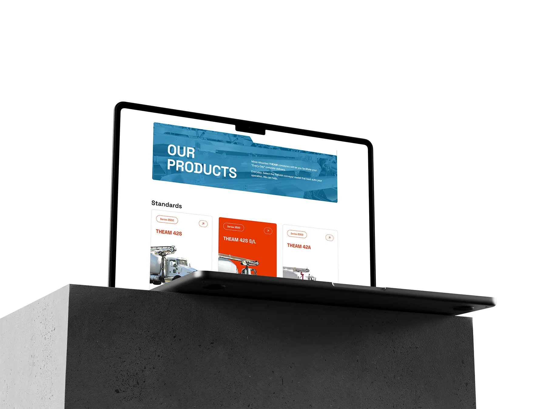
For the website, we approached it with the same level of intention. Every page was custom designed and mapped out in Figma, allowing for collaborative feedback and refinement before development began. We traveled on site to capture original photography and produced a brand video to ensure the story felt authentic and grounded in real operations. Every piece of content, from imagery to copy, was created specifically for THEAM. No stock visuals, no recycled messaging. The final product is a fully custom digital experience that integrates the new icon throughout and truly represents who they are. Most importantly, it is a site they are proud of and genuinely love.