


Not sure where to start? Every engagement starts with a free discovery call.
Request a coffee dateYour journey, our canvas
Branding, websites and apps for business owners across Greater Boston.
See all projectsServices
Instead of the familiar tea leaf, we built the Saunna Tea brand around the Camellia sinensis flower, the blossom of the plant that true tea comes from.
Instead of the familiar tea leaf, we built the Saunna Tea brand around the Camellia sinensis flower, the blossom of the plant that true tea comes from. See how we designed a flexible emblem system and a warm, premium identity for a West Indian family tea brand rooted in the bush teas of St. Kitts.
Saunna Tea is a West Indian, family founded tea brand that sets out to bring you “a whole cup of tea and more”. Its founder was born and raised on the small island of St. Kitts and grew up gathering local plants like lemongrass and mint for medicinal and everyday use. At sixteen, the founder moved to Boston to pursue dreams of entrepreneurship. The move brought culture shock, and the remedy from a West Indian mother was simple: sip bush tea, known in the United States as herbal tea. Those cups reminded the founder of home, and they helped. The company idea came from a good moment at a Starbucks, where a cup read “Saunna” next to the word “tea”. The business took shape during the pandemic. The blends use high-quality organic ingredients without preservatives or fragrances and are handcrafted locally in small batches, fresh to order.
Visit the Saunna Tea websiteSaunna Tea wants to be known for premium taste, a distinct story and vibrant cultural expression, with TWG Tea as its benchmark. It also wants to move tea past the idea of a drink only for “girls and old ladies”. Earlier mockups leaned on the St. Kitts flag colors and the hibiscus (sorrel) flower, and the client was open to moving past them. The brief called for a look that is modern, timeless and tropical, yet sophisticated enough for a wide age range. It had to speak to the Caribbean diaspora missing home and to new customers tasting the flavors for the first time. It had to sit on display anywhere from a Dorchester apartment to a Cape Cod home without feeling so exclusive it pushed people away. It also had to work across many blends, labels and seasons.

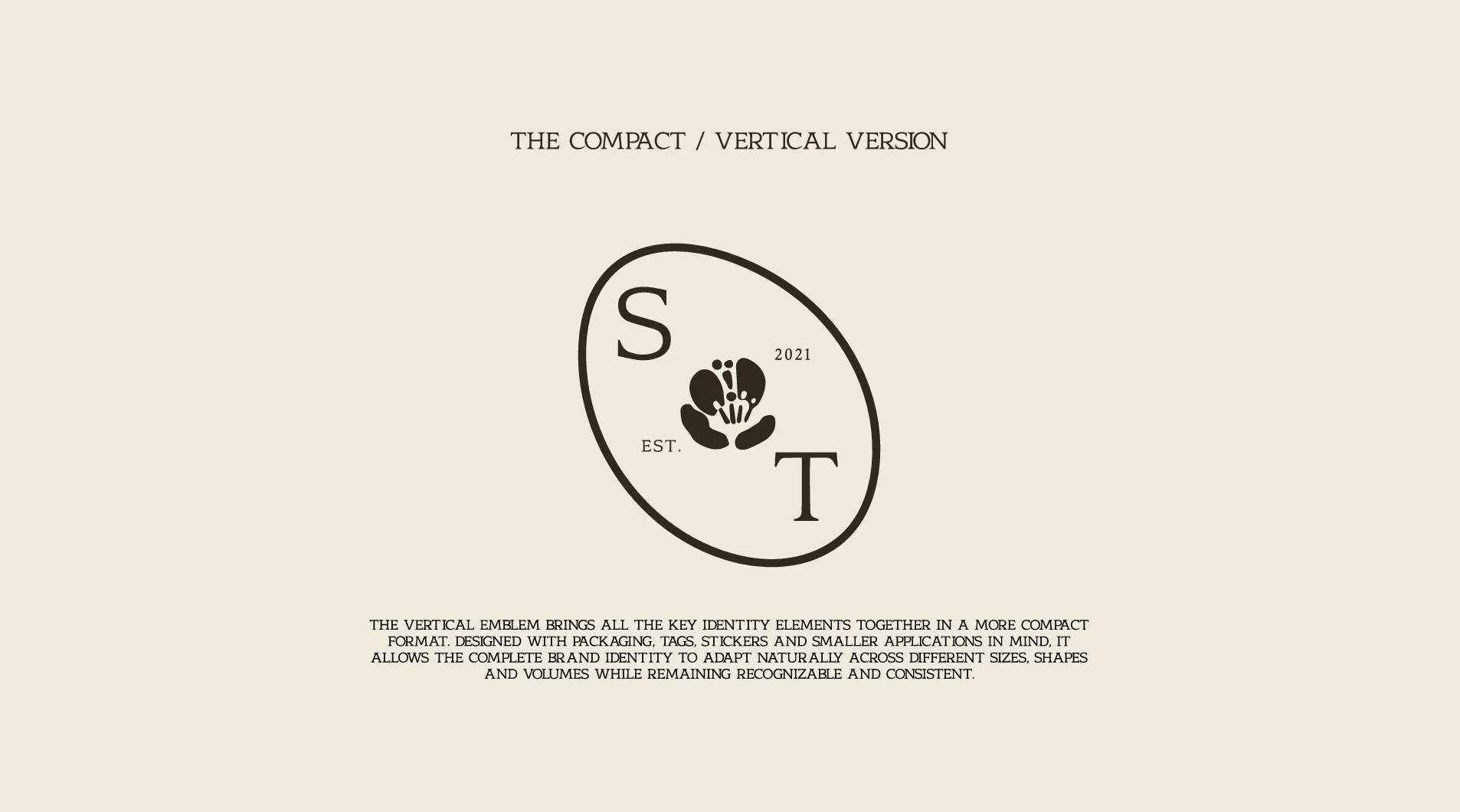
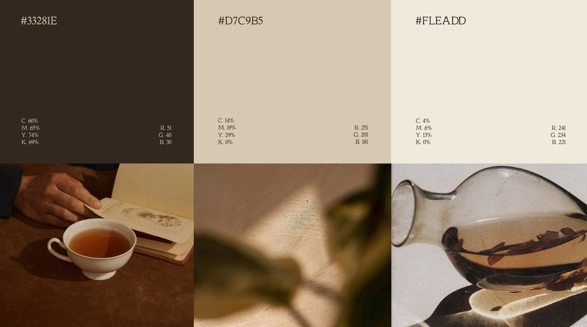
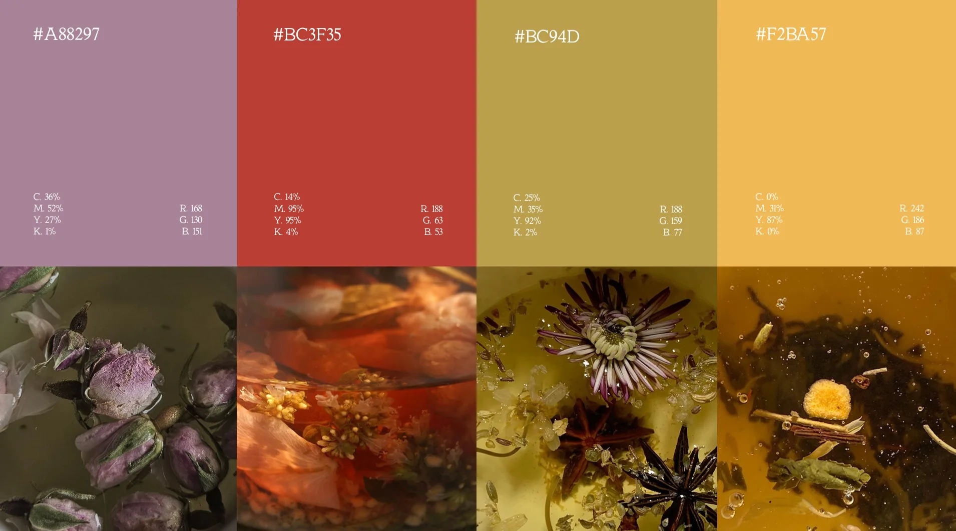
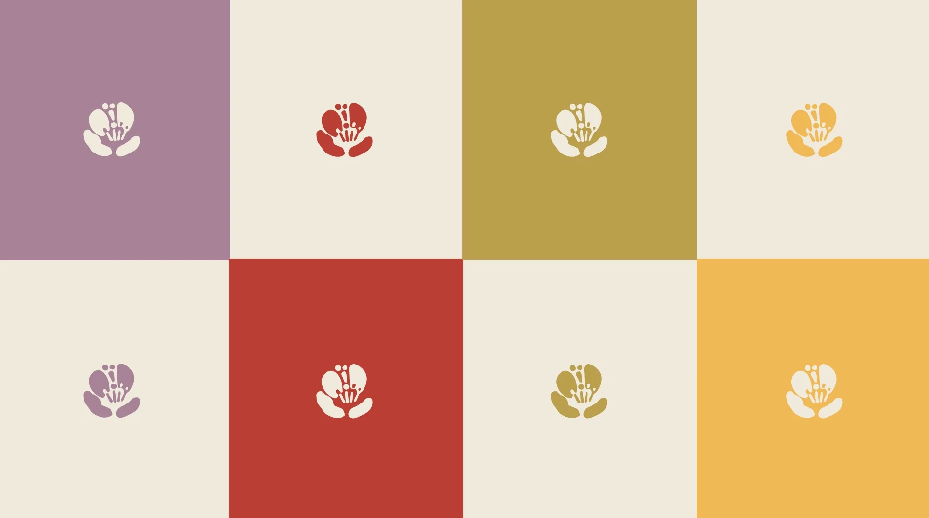
We started with the plant itself. Rather than the familiar tea leaf, we built the emblem around the Camellia sinensis flower, the blossom of the plant that true tea comes from. It ties the brand directly to the essence of tea, and it is more distinctive and refined than a leaf. We kept the flower raw and hand sketched, so it feels earthy, organic and handcrafted, like the blends. Classic typography balances it and keeps the identity timeless and elegant. The logo works as a flexible emblem system in three parts. The flower icon stands on its own for simplified use. The full logo fits websites and email signatures. A compact vertical emblem places the S and T initials and the flower inside an oval, for small labels and circular packaging seals. For color, we moved past the flag. A neutral base of dark brown, beige and cream makes up about 80% of the design. The other 20% comes from four accents: mauve, red, olive gold and golden yellow. They set each blend or seasonal theme apart while the brand stays cohesive. We paired a serif with a handwritten script, a mix that feels authentic and established, yet personal. We showed the identity on a menu, packaging stickers, store signage and tote bags. Saunna Tea called the concept genius and singled out the ST emblem and the circular packaging. We treat every client’s brand as our own, and we built this one to last at least five years, because frequent rebranding is expensive and hurts recognition.
 One flower, three forms: icon, full logo and ST emblem
 Accent colors that set each blend and season apart
I worked with Rootless Agency on a rebranding project and had a wonderful experience. As someone new to professional branding, I appreciated how Xhulio and the team guided the process and translated our brand story and ideas into a cohesive, timeless visual identity. I had previously created my own logo but wanted a fresh, professional direction rooted in the story behind the business. Rootless treated my business as if it were their own, and that care showed throughout the entire process. I’m delighted with the result and excited to begin implementing it. Xhulio was also professional and collaborative when coordinating with my trademark attorney during the logo refinement and filing process. That communication made an important part of the project feel well supported. I would gladly work with Rootless again and look forward to exploring product labeling and website design when the brand is ready for those stages.

Free discovery call
Ready to take your business to new heights? Start with a free discovery call. Coffee, tea or your favorite drink, complimentary on us.
Working with Rootless Agency was a fantastic experience from start to finish!
Lori Glaser Korn
Owner, LGK Interiors
I can’t say enough wonderful things about Rootless Agency and working with them to bring my brand to life.
Chiara Campoverde
Founder, HOT
Had a super smooth experience working with Xhulio and the Rootless team.

YMCA of Greater Boston
Food Access and Mobile Market pages
I had a fantastic experience working with Rootless Agency to create my website.
Joe
CEO, Boston Doors & Windows
Rootless developed our website and we couldn’t be happier.
Alan Sanchez
CEO, Link Solutions
Rootless treated my business as if it were their own, and that care showed throughout the entire process.
Lasaunna Powell
Founder, Saunna Tea
Tell us a little about your project. We reply within one business day.
1You send this
2Free discovery call
3Clear plan and price
This site is protected by reCAPTCHA and the Google Privacy Policy and Terms of Service apply.


